|
|
 |
|

06-25-2014, 09:10 PM
|
|
Colonel
|
|
Join Date: Mar 2003
Location: Kettering
Posts: 1,441
Thanks: 1,447
Thanked 1,167 Times in 450 Posts
|
|
|
I don't think tomorrow is about the logo.
|
06-26-2014, 05:15 PM
|
 |
Captain
|
|
Join Date: Dec 2007
Location: Dayton, OH
Posts: 388
Thanks: 83
Thanked 453 Times in 159 Posts
|
|
|
Well it looks like the "BIG reveal" turned out to be the Elite 8 rings for the players and coaches that came in today. Still very cool, but I was hoping to see the new logo. I would assume we see it before summer is over.
|
|
2 UDPriders Offer Mad Props to UDFlyer23 For This Totally Excellent Post:
|
|
06-26-2014, 05:18 PM
|
|
Lieutenant General
|
|
Join Date: Mar 2008
Posts: 4,485
Thanks: 8,460
Thanked 6,618 Times in 2,467 Posts
|
|
|
|
07-02-2014, 02:59 PM
|
 |
Colonel
|
|
Join Date: Oct 2007
Posts: 1,134
Thanks: 15
Thanked 614 Times in 351 Posts
|
|
Here is a picture of my favorite University of Dayton logo ball cap. I bought this hat a couple of years ago. I keep it for good and only wear it on special occassions. I've never seen another one like it. It has a logo of a fierce looking "Rudy". I think this is the very best logo. Take a look....
 [/IMG]
|
|
3 UDPriders Offer Mad Props to Buckleyma For This Totally Excellent Post:
|
|
07-02-2014, 03:56 PM
|
|
General of the Air Force
|
|
Join Date: Feb 2009
Posts: 7,778
Thanks: 5,498
Thanked 6,255 Times in 3,097 Posts
|
|
Originally Posted by Buckleyma

Here is a picture of my favorite University of Dayton logo ball cap. I bought this hat a couple of years ago. I keep it for good and only wear it on special occassions. I've never seen another one like it. It has a logo of a fierce looking "Rudy". I think this is the very best logo. Take a look....
[/IMG]
|
Maybe this is derailing the thread but it is an offseason thread about logos so... I would love to have one of those driver head covers of Rudy.
|
|
Mad Props to CE80 For This Totally Excellent Post:
|
|
07-02-2014, 08:17 PM
|
 |
Brigadier General
|
|
Join Date: Dec 2008
Location: Dayton, Ohio
Posts: 2,086
Thanks: 768
Thanked 2,029 Times in 766 Posts
|
|
|
From somebody in the know...
The new logo will be unveiled later this month.
|
|
4 UDPriders Offer Mad Props to jumpin' joe For This Totally Excellent Post:
|
|
07-02-2014, 08:29 PM
|
 |
Brigadier General
|
|
Join Date: Nov 2008
Location: Dayton
Posts: 2,023
Thanks: 8,274
Thanked 897 Times in 553 Posts
|
|
|
We'll see it when we get our request to re-up our tickets this month. I'll bet.
|
07-03-2014, 10:58 PM
|
|
General
|
|
Join Date: Sep 2007
Location: Between Kroger & Esther Price
Posts: 5,745
Thanks: 9,138
Thanked 4,539 Times in 2,056 Posts
|
|
Originally Posted by Buckleyma
Here is a picture of my favorite University of Dayton logo ball cap. I bought this hat a couple of years ago. I keep it for good and only wear it on special occassions. I've never seen another one like it. It has a logo of a fierce looking "Rudy". I think this is the very best logo. Take a look....
[/IMG]
|
I thought this pic was a really large woman bending over in the garden . . .
Kinda ruined the logo for me 
___________________
Whether your glass is half empty or half full, you still have more to drink.

|
07-05-2014, 11:57 PM
|
|
Brigadier General
|
|
Join Date: Apr 2001
Posts: 2,467
Thanks: 208
Thanked 1,020 Times in 479 Posts
|
|
|
I have to admit, that although i've wanted UD to change their logo almost since the moment they unveiled the current one in the 90's, i'm a bit scared to see what it's going to look like.
I am more of a fan of classic looking stuff. And i'm encouraged that from what i've heard, the uniforms have a sort of syracuse look to them. Blockier letters. Clean look. A little tighter, not as loose.
As far as the logo goes, it's always bugged me that dayton has not made more of the name 'flyers' or flight. We are the only team in all of D1 who has that name. And not making something of it is a missed opportunity. I don't mean in a corny 'speed' sort of way that they're describing the new one. I mean literally, having an icon or logo of a classic WW2 P40 warhawk (look it up...it's sweet) or some other form of cool looking plane the way that Gonzaga just has a bulldog that represents them in certain instances.
What is not encouraging is that, from all the logos in the world to rip off, it sounds like Dayton decided to rip off the only other franchise in all of sports with the Flyers name. That seems pretty weak to me.
At the very least, i pray that they don't have the stupid logo at a diagonal. It made it impossible to look good with anything else on a shirt or a page. I hope they showed a little restraint, and picked something that won't feel outdated the moment they reveal it. That's why the more classic stuff is the way to go. But i hope this also signifies an upgrade in the merchandise. Because outside of Billy Tees, there really hasn't been much in terms of well-designed stuff for sale.

|
|
Mad Props to Flyer'95 For This Totally Excellent Post:
|
|
07-06-2014, 01:13 PM
|
|
1st Lieutenant
|
|
Join Date: Mar 2008
Location: Beavercreek
Posts: 190
Thanks: 24
Thanked 115 Times in 33 Posts
|
|
Logo will be officially revealed on August 1 and everybody is going to hate it...
|
|
Mad Props to UDGRIZZ2010 For This Totally Excellent Post:
|
|
07-06-2014, 02:28 PM
|
 |
General of the Air Force
|
|
Join Date: May 2001
Location: St. Louis
Posts: 8,906
Thanks: 3,535
Thanked 3,787 Times in 1,933 Posts
|
|
Think Philadelphia Flyers logo but with a D instead of the P and with red and blue
http://shop.nhl.com/Philadelphia_Fly...adelphiaFlyers

Last edited by Avid Flyer; 07-06-2014 at 02:36 PM..
|
07-06-2014, 03:12 PM
|
|
Lieutenant General
|
|
Join Date: Jul 2009
Posts: 4,129
Thanks: 1,959
Thanked 2,464 Times in 1,288 Posts
|
|
Originally Posted by UDGRIZZ2010
Logo will be officially revealed on August 1 and everybody is going to hate it...
|
Everybody? Might be some, might even be most, but doubt it will be everybody. Please don't try to impose your likes or dislikes on 'everybody".
|
07-06-2014, 05:51 PM
|
|
|
|
Join Date: Mar 2007
Posts: 13,238
Thanks: 3,991
Thanked 4,603 Times in 2,849 Posts
|
|
|
Careful...
Originally Posted by UDGRIZZ2010
Logo will be officially revealed on August 1 and everybody is going to hate it...
|
Hopefully, that's what UD has been...very deliberate and careful.
About a year ago UConn changed the loveable husky dog logo that it had used for years and that everyone loved. The new husky was roundly panned and criticized. "No one" liked it.
But the administration had lived with the new design for months before revealing it.....with some tweeking along the way, I'm sure.
Now everyone seems to love the new husky. Not a peep of criticism.
Change is hard. Let's hope UD has been "living" with the new design long enough to ensure that the inevitable initial criticism will be short lived.
|
07-06-2014, 06:01 PM
|
|
Brigadier General
|
|
Join Date: Nov 2008
Location: Dayton
Posts: 2,023
Thanks: 8,274
Thanked 897 Times in 553 Posts
|
|
|
If these reports are true then I'm already disappointed with it. I think it could be based on an earlier design and be broadly accepted.
|
|
Mad Props to FLYER5 For This Totally Excellent Post:
|
|
07-06-2014, 07:09 PM
|
|
Colonel
|
|
Join Date: Feb 2009
Location: Chicago suburbs
Posts: 1,176
Thanks: 1,661
Thanked 747 Times in 350 Posts
|
|
|
|
07-06-2014, 08:33 PM
|
|
Brigadier General
|
|
Join Date: Apr 2001
Posts: 2,467
Thanks: 208
Thanked 1,020 Times in 479 Posts
|
|
Just to stir the pot here. If the rumors of the jerseys and philly-flyers-ish logo are true, they'd look something like this.
http://i62.tinypic.com/wiwqrl.jpg
I like the simplicity of the jerseys, particulalry if they'll have the different squares of color (columbia blue anyone?) down the shorts the way syracuse's do.
I would still prefer a more collegiate typeface on the jerseys, like this sort of deal:
http://i60.tinypic.com/4gq9z9.jpg
I'm going to have to reserve judgement on the logo itself until i see the real thing. This is all just based on conjecture. But i gotta believe it will be better than what i have here, and better than what we have now. It'd be hard to make it worse.
|
|
Mad Props to Flyer'95 For This Totally Excellent Post:
|
|
07-06-2014, 09:33 PM
|
 |
|
|
Join Date: Feb 2007
Location: Dayton, OH
Posts: 13,611
Thanks: 1,854
Thanked 17,159 Times in 5,119 Posts
|
|
|
Ive seen the logo, and discussed it with UD. I have also developed logos for businesses, events, and marketing platforms.
If there is one universal truth about branding it is this: the goal is to get 50% of the people to tolerate it. If you can do that, you have knocked it out of the park. There is no such thing as consensus when talking visual identity. If you ask 100 people for input, you will get 100 different suggestions -- many of them completely hair-brained and without any knowledge or context of how you must develop identities that work with all kinds of branding platforms including ink, thread, print, and the web. There are certain logos that will just not work with thread because they are too intricate or complex or costly to do properly which will take a $55 polo and make it $85 because it needs 6 colors and 32,000-stitch counts.
It is not easy. Im sure at least half of you hate the UDPride logo. It will be interesting to see if any of my constructive comments end up in the final version UD settles on. It was about 90% done when I saw it. But, I cannot comment on what I saw.
__________________
Hot shooting hides a multitude of sins.
"Yeah....220, 221, whatever it takes." - Jack Butler (Mr. Mom)
|
|
Mad Props to Chris R For This Totally Excellent Post:
|
|
07-07-2014, 12:37 AM
|
|
Brigadier General
|
|
Join Date: Apr 2001
Posts: 2,467
Thanks: 208
Thanked 1,020 Times in 479 Posts
|
|
|
Chris, i work in this world too. And it's a thankless task for sure. It's got to work in a million instances, big and small. You've to to think of every iteration of it. And it's got to lend itself to great merchandise. Then you've got a million people in the process (many of whom have little to no creativity, and questionable design taste) who get a say. And that's the surest way to make bad work. I do think that the university and town of dayton has a ton of history, UD has a unique namesake, and for that reason should make more of it.
I'm definitely very interested on where they netted out. I'm pretty certain that i'll like it more than the current logo.
|
|
Mad Props to Flyer'95 For This Totally Excellent Post:
|
|
07-07-2014, 09:12 AM
|
 |
Major General
|
|
Join Date: May 2014
Location: NJ Beach Livin'
Posts: 3,237
Thanks: 1,489
Thanked 1,915 Times in 1,085 Posts
|
|
 If we can get past this we can get pass anything. Right?
Originally Posted by Flyer'95
As far as the logo goes, it's always bugged me that dayton has not made more of the name 'flyers' or flight. We are the only team in all of D1 who has that name. And not making something of it is a missed opportunity.
At the very least, i pray that they don't have the stupid logo at a diagonal. It made it impossible to look good with anything else on a shirt or a page. I hope they showed a little restraint, and picked something that won't feel outdated the moment they reveal it. That's why the more classic stuff is the way to go. But i hope this also signifies an upgrade in the merchandise. ...
|
Flyer'95 I agree with your comment about flight, flyers and conjuring up images of aviation ... ... however the ONLY issue with incorporating a picture of some type of aircraft is that the plane or what have you gets dated rather quickly i.e. an F15 verses a F35. Also what represents a special look for an aviation vehicle? The imagery should immediately tell the story or have a connection. A Bulldog pretty much stays the same and a picture of one pretty much tells you what it is .... The Hockey team in Philly almost always uses the term Flyers ... "Flyers" Should/could that be a secondary or 2nd tier logo version?
Has rollo seen your post? You can't use the terms I pray, I hope, etc. ! 
Originally Posted by UACFlyer
Hopefully, that's what UD has been...very deliberate and careful.
About a year ago UConn changed the loveable husky dog logo that it had used for years and that everyone loved. The new husky was roundly panned and criticized. "No one" liked it.
.....
But the administration had lived with the new design for months before revealing it.....with some tweeking along the way, I'm sure.
Change is hard. Let's hope UD has been "living" with the new design long enough to ensure that the inevitable initial criticism will be short lived.
|
UAC It sounds like your describing the recent changes UD made to their BB music program!! (Except maybe for the deliberate and careful part.)(Except for the not a peep of criticism part.) (except for the ..... oh you know what I mean!)
Originally Posted by Chris R
Ive seen the logo, and discussed it with UD.
|
Chris R Did the discussion go like this?:
What the #$$%^ and &*^%@! What were you guys *(+!#~** thinking? How could you +)*^$## go ahead and do something so @#!~&*(%+ stupid? 
|
|
4 UDPriders Offer Mad Props to NJFlyr71 For This Totally Excellent Post:
|
|
07-07-2014, 03:26 PM
|
 |
1st Lieutenant
|
|
Join Date: Apr 2014
Location: Chicago, IL
Posts: 184
Thanks: 238
Thanked 138 Times in 77 Posts
|
|
|
Personally, I love the Dayton Flyers diagonal logo that's at center court. Not looking forward to anything new.
I think it stinks, personally, that we're going through a re-branding right when our brand is starting to get more and more recognition.
|
|
2 UDPriders Offer Mad Props to bhflyer5 For This Totally Excellent Post:
|
|
07-07-2014, 03:59 PM
|
|
Brigadier General
|
|
Join Date: Apr 2001
Posts: 2,467
Thanks: 208
Thanked 1,020 Times in 479 Posts
|
|
NJFlyr, that's why i'd actually go with something pretty classic rather than chasing trends. And if the logo of that thing starts to feel tired, you can always re-iterate it in a fresher way. For instance, names like trojans, spartans, black knights, cowboys, minutemen, 49ers, vikings, pirates are named after things that existed hundreds if not thousands of years ago. It's up to the designers to keep the look of those names and schools identity fresh.
To me, something like this incorporated as our logo or as the visual for the flyers would have been pretty bad-a$$ and completely and totally unique to dayton. The warhawk was even designed in dayton during WW2.
http://tinypic.com/view.php?pic=34ya...8#.U7r6Jo1dWPY
I would buy a hat with a simplified version of something like that on it, with dayton on the back.
|
07-07-2014, 04:32 PM
|
|
Major General
|
|
Join Date: May 2014
Location: NJ Beach Livin'
Posts: 3,237
Thanks: 1,489
Thanked 1,915 Times in 1,085 Posts
|
|
|
Warhawk or Flyer?
Branding is a BIG DEAL.
You have to make sure that you do not muddle the identity. I think the P40 was pretty cool in its day and now when I have seen it fly at airshows but it is, in the end, A WWII symbol.
I think named logo's (i.e. Bulldogs, Huskies, Dayton Flyers) are a little bit easier in that to making changes to how the words are presented (font, color, styling) is all possible in variations ... But if the change makes someone look at it and not be able to identify what the heck it represents i.e. like the Phillies P shown in this thread you have blown it. Now it works in Hockey since they have a league advert budget that goes nationally in markets the team plays and in many papers that report on the sport.
A "D" represents who, where, why? Dayton on the shirt, gosh saw that on the NCAA TV and IF nothing else could make someone google it readily. But "D"?
AND if you can't really ascertain that it is a "D" you've blown it in my opinion ..
So I am signing off on this thread ... too much conjecture (including by me) I will wait and see ....
|
07-07-2014, 04:53 PM
|
|
|
|
Join Date: Mar 2007
Posts: 13,238
Thanks: 3,991
Thanked 4,603 Times in 2,849 Posts
|
|
|
Terms of use matter
UD will establish a protocal (rules) for how the "D" is to be used and not used. Most likely the D will almost never be used alone. Outside of the Dayton region not a soul would know what it meant.
There are a half dozen schools (maybe) for which a single letter-type logo would identify the school. ND, of course,....very few others.
So, the D will almost always be used as part of and/or in connection with the word Dayton, Dayton Flyers, etc.
Yesterday I saw a guy wearing a red baseball cap with a white block "O" on it, trimmed in what I think was grey. I'm pretty sure it was a tOSU cap. And except for OSU alums living in CT I'm probably the only guy that would connect that cap with Ohio State. Anyone think tOSU has a branding or recognition problem? I don't think so.
What matters is that it looks nice. Soon we'll know.
|
07-07-2014, 06:42 PM
|
|
|
|
Join Date: Feb 2008
Location: Beavercreek
Posts: 3,953
Thanks: 4,077
Thanked 4,302 Times in 1,764 Posts
|
|
Easy to knock UD and decision making. I have been critical of their conservative risk averse approach in the past.
I like what I saw of the new logo. More importantly, Archie is enthusiastic and believes it will help recruiting. That ends discussion for me. I am a fan of what Archie has achieved. I think he has a different approach to coaching college basketball. His record during the last 3 years has been achieved with some smoke and mirrors at times. he has been short handed, taken rejects from other programs, found hidden gems and developed some skills in players that I thought not possible.
During the NIT run, the players talked BG into wearing black uniforms. They looked like a different team. Not to say the uniforms won the NIT. Image is important to athletes. Players obsess about brands of gym shoes, colors, etc...They like slick, fast and yes black as a color of power and strength. North Carolina gets away with Powder Blue, but I don't think UD can. Archie is trying to compete against higher and higher level programs for talent now. He can use EVERY tool possible. I say, give it to him.
So as Chris R said, some will hate it. I believe it hits the right audience, loyal UD fans who hate the new logo will wear with pride.
Brands and logos can't please everyone. Except for looking to close to the Philadelphia Flyers, I think it looks good.
|
|
2 UDPriders Offer Mad Props to SeasonTicketFan For This Totally Excellent Post:
|
|
07-07-2014, 08:55 PM
|
 |
Captain
|
|
Join Date: Apr 2007
Location: Centerville,Ohio
Posts: 431
Thanks: 240
Thanked 223 Times in 121 Posts
|
|
Originally Posted by UACFlyer
Yesterday I saw a guy wearing a red baseball cap with a white block "O" on it, trimmed in what I think was grey. I'm pretty sure it was a tOSU cap. And except for OSU alums living in CT I'm probably the only guy that would connect that cap with Ohio State. Anyone think tOSU has a branding or recognition problem? I don't think so..
|
Couldn't have been a tOSU cap.
The "t" can only be used by the best team in Ohio. So....let's see wait and see what "The" Dayton Flyers new look will be.
|
07-07-2014, 09:00 PM
|
|
Lieutenant General
|
|
Join Date: Nov 2004
Posts: 4,867
Thanks: 2,939
Thanked 1,452 Times in 781 Posts
|
|
Originally Posted by UACFlyer
UD will establish a protocal (rules) for how the "D" is to be used and not used. Most likely the D will almost never be used alone. Outside of the Dayton region not a soul would know what it meant.
There are a half dozen schools (maybe) for which a single letter-type logo would identify the school. ND, of course,....very few others.
So, the D will almost always be used as part of and/or in connection with the word Dayton, Dayton Flyers, etc.
Yesterday I saw a guy wearing a red baseball cap with a white block "O" on it, trimmed in what I think was grey. I'm pretty sure it was a tOSU cap. And except for OSU alums living in CT I'm probably the only guy that would connect that cap with Ohio State. Anyone think tOSU has a branding or recognition problem? I don't think so.
What matters is that it looks nice. Soon we'll know.
|
North Dakota?
|
|
Mad Props to DetroitFlyer For This Totally Excellent Post:
|
|
07-07-2014, 09:42 PM
|
|
Captain
|
|
Join Date: Jan 2008
Posts: 257
Thanks: 50
Thanked 109 Times in 58 Posts
|
|
|
Not to sound like a smart a$$ but has anyone under the age of 40 seen the logo, and what is your impression?
|
|
Mad Props to flyer2003 For This Totally Excellent Post:
|
|
07-07-2014, 10:28 PM
|
 |
Brigadier General
|
|
Join Date: Jan 2002
Posts: 2,113
Thanks: 954
Thanked 1,752 Times in 794 Posts
|
|
Originally Posted by UDGRIZZ2010
Logo will be officially revealed on August 1 and everybody is going to hate it...
|
I heard it would be revealed on the floor on the 18th.
|
07-07-2014, 10:50 PM
|
|
|
|
Join Date: Feb 2007
Location: Dayton, OH
Posts: 13,611
Thanks: 1,854
Thanked 17,159 Times in 5,119 Posts
|
|
|
Archie was not in love w/the existing logo. Neither was Dr Dan. In fact, most at UD were unhappy with it. It was put together about 25yrs ago and was one of those things where nobody really had a consensus on what worked, so they picked the existing one and just put it to bed. I believe there is much more thought put into the new attempt. The criticisms most of you have given that the diagonal "flying" shape of the existing logo is a UD pet peeve too. It made it exceedingly difficult to fit into confined spaces. Television hated it because it did not fit well into those logo boxes. If you were paying close attention, you'd have noticed that Archie wore UD polos and other apparel where the diagonal shape was altered so it was straight across where DAYTON and FLYERS with the contrails was horizontal. That was his personal tweak to make the best of things in the interim. BG was more involved in uniform design and not logo stuff -- he would spend time looking through the Nike catalogs designing things that would go well together. UD didnt (and I think still doesnt) have the kind of Nike account that allows them to design their own uniforms from scratch like the big dogs can. So we have to use whats in the catalog and then tweak as needed. John at KK might know more about this as he also deals w/Nike and UD as a trio. There is a pecking order at Nike however. We are not Oregon or Duke. If you want the UD chapel in silhouette background on the back of the jerseys, its probably not happening.
From my talks with UD, they are attempting to create a brand that is more than just a logo. Its more like a schematic/theme they are striving for that can be used in different ways, with different sports, on different types of apparel, on different sports equipment for UD athletics, and in different marketing ways to grow the overall UD brand.
Im excited just because I like it when UD is proactive and takes some chances. Id rather see us take some risks and fail, than live inside our cocoon of comfort and never try different things because of the fear of failure. Failure is ok. Being scared to make mistakes: not ok.
__________________
Hot shooting hides a multitude of sins.
"Yeah....220, 221, whatever it takes." - Jack Butler (Mr. Mom)
|
|
13 UDPriders Offer Mad Props to Chris R For This Totally Excellent Post:
|
Cleve (07-16-2014), FLYER5 (07-07-2014), flyerfanatic86 (07-08-2014), Gem City (07-08-2014), hayjim (07-09-2014), jack72 (07-08-2014), jpk4ud (07-08-2014), Justin (07-08-2014), NJFlyr71 (07-08-2014), The Fly (07-08-2014), UDBaby (07-14-2014), UDFlyer23 (07-08-2014), udstevied_D87 (07-08-2014) |
07-07-2014, 10:55 PM
|
|
Captain
|
|
Join Date: Jan 2008
Posts: 257
Thanks: 50
Thanked 109 Times in 58 Posts
|
|
|
I'm certainly anxious. I just think simple is good. I hate to say it, but I just don't trust that this won't end up looking tacky based on what I'm hearing. Give me something classy to put on a new cap and I'll be happy.
|
|
Mad Props to flyer2003 For This Totally Excellent Post:
|
|
07-07-2014, 11:21 PM
|
|
Brigadier General
|
|
Join Date: Apr 2001
Posts: 2,467
Thanks: 208
Thanked 1,020 Times in 479 Posts
|
|
|
It almost can't get worse. The diagonal was impractical. The UD logo was cartoonish. Neither of them were particularly pretty or unique. It was very outdated and felt like the logo of a struggling professional lacrosse team.
Chris, any word on whether they will deepen or alter any of the colors? I hope they go for a deeper red and deeper blue and keep the light blue as an accent at the very least. All the colors we've had over the past 20 years felt a bit middle of the road and cheap.
Once they change the logo, they need to get a handle on merchandising. They are all over the board in terms of designs, colors, uses of the logo, other fonts, etc. Seems like they let everyone and their mother design apparel for them, and the only truly good stuff is the sort of underground stuff at Homage or Billy Tees.
|
07-08-2014, 08:52 AM
|
|
Major General
|
|
Join Date: May 2014
Location: NJ Beach Livin'
Posts: 3,237
Thanks: 1,489
Thanked 1,915 Times in 1,085 Posts
|
|
|
|
07-08-2014, 09:10 AM
|
 |
I Am A Statistical God
|
|
Join Date: Mar 2008
Location: Riverside, Ohio
Posts: 5,511
Thanks: 4,692
Thanked 6,171 Times in 2,321 Posts
|
|
|
I remember the debacle that was the NY Islanders logo switch. They changed from a circle puck, with NY and the Y as a hockey stick down the middle, with the Long Island silhouette across the middle, and went with the Gorton's Fisherman instead. Absolute shock and distaste from all around. I think I still have a sweatshirt with the Fisherman logo on it, even though, they changed back to the circle puck logo within one year, I believe.
|
07-08-2014, 09:18 AM
|
|
Lieutenant General
|
|
Join Date: Nov 2004
Posts: 4,867
Thanks: 2,939
Thanked 1,452 Times in 781 Posts
|
|
Never trust anyone over 30....
|
07-08-2014, 09:33 AM
|
|
Major General
|
|
Join Date: May 2014
Location: NJ Beach Livin'
Posts: 3,237
Thanks: 1,489
Thanked 1,915 Times in 1,085 Posts
|
|
Originally Posted by DetroitFlyer
Never trust anyone over 30....
|
I agree. BO is over 30.
|
|
Mad Props to NJFlyr71 For This Totally Excellent Post:
|
|
07-08-2014, 10:24 AM
|
|
Captain
|
|
Join Date: Jan 2008
Posts: 257
Thanks: 50
Thanked 109 Times in 58 Posts
|
|
|
I trust people over 40 more than under 40 on almost everything other than when it comes to "what looks good".
|
|
3 UDPriders Offer Mad Props to flyer2003 For This Totally Excellent Post:
|
|
07-08-2014, 10:50 AM
|
|
Major
|
|
Join Date: Dec 2001
Posts: 647
Thanks: 53
Thanked 618 Times in 221 Posts
|
|
Originally Posted by Chris R
Archie was not in love w/the existing logo. Neither was Dr Dan. In fact, most at UD were unhappy with it. It was put together about 25yrs ago and was one of those things where nobody really had a consensus on what worked, so they picked the existing one and just put it to bed. I believe there is much more thought put into the new attempt. The criticisms most of you have given that the diagonal "flying" shape of the existing logo is a UD pet peeve too. It made it exceedingly difficult to fit into confined spaces. Television hated it because it did not fit well into those logo boxes. If you were paying close attention, you'd have noticed that Archie wore UD polos and other apparel where the diagonal shape was altered so it was straight across where DAYTON and FLYERS with the contrails was horizontal. That was his personal tweak to make the best of things in the interim. BG was more involved in uniform design and not logo stuff -- he would spend time looking through the Nike catalogs designing things that would go well together. UD didnt (and I think still doesnt) have the kind of Nike account that allows them to design their own uniforms from scratch like the big dogs can. So we have to use whats in the catalog and then tweak as needed. John at KK might know more about this as he also deals w/Nike and UD as a trio. There is a pecking order at Nike however. We are not Oregon or Duke. If you want the UD chapel in silhouette background on the back of the jerseys, its probably not happening.
From my talks with UD, they are attempting to create a brand that is more than just a logo. Its more like a schematic/theme they are striving for that can be used in different ways, with different sports, on different types of apparel, on different sports equipment for UD athletics, and in different marketing ways to grow the overall UD brand.
Im excited just because I like it when UD is proactive and takes some chances. Id rather see us take some risks and fail, than live inside our cocoon of comfort and never try different things because of the fear of failure. Failure is ok. Being scared to make mistakes: not ok.
|
I remember when they unveiled the current logo. It was at midnight madness for the 1994-1995 season. Dan Patrick was the MC and Oliver Purnell was our new coach. Everyone was excited to see the new logo and then.....ugh....Well, it was a flop from the very beginning. It was better than what we had at the time, but still a disappointment. A new logo is long overdue.
|
07-08-2014, 10:53 AM
|
|
Major
|
|
Join Date: Dec 2001
Posts: 647
Thanks: 53
Thanked 618 Times in 221 Posts
|
|
|
Here is hoping they go with a darker color red and blue too!!
Remember who the target market is for this logo. It's the younger generation. (15 to 30) Almost anything will be an improvement. I have faith in the university.
|
|
Mad Props to Gem City For This Totally Excellent Post:
|
|
07-08-2014, 10:57 AM
|
 |
|
|
Join Date: Aug 2001
Location: RolloCon
Posts: 16,574
Thanks: 16,265
Thanked 15,914 Times in 6,996 Posts
|
|
|
I look good in black...so here's a vote for black with some (blood) red and (deep navy) blue trim.
__________________
I shaved my balls for this?
|
|
Mad Props to rollo For This Totally Excellent Post:
|
|
07-08-2014, 11:11 AM
|
|
1st Lieutenant
|
|
Join Date: Apr 2014
Location: Chicago, IL
Posts: 184
Thanks: 238
Thanked 138 Times in 77 Posts
|
|
Originally Posted by Flyer'95
NJFlyr, that's why i'd actually go with something pretty classic rather than chasing trends. And if the logo of that thing starts to feel tired, you can always re-iterate it in a fresher way. For instance, names like trojans, spartans, black knights, cowboys, minutemen, 49ers, vikings, pirates are named after things that existed hundreds if not thousands of years ago. It's up to the designers to keep the look of those names and schools identity fresh.
To me, something like this incorporated as our logo or as the visual for the flyers would have been pretty bad-a$$ and completely and totally unique to dayton. The warhawk was even designed in dayton during WW2.
http://tinypic.com/view.php?pic=34ya...8#.U7r6Jo1dWPY
I would buy a hat with a simplified version of something like that on it, with dayton on the back.
|
 If that warhawk got anywhere near a flyer logo it would look like an affliction shirt. I then may have to switch my allegiance unless I'd be able to only wear "throwback" shirts with the former logo.
|
07-08-2014, 11:16 AM
|
|
1st Lieutenant
|
|
Join Date: Apr 2014
Location: Chicago, IL
Posts: 184
Thanks: 238
Thanked 138 Times in 77 Posts
|
|
|
|
07-08-2014, 11:17 AM
|
|
General of the Air Force
|
|
Join Date: May 2001
Location: St. Louis
Posts: 8,906
Thanks: 3,535
Thanked 3,787 Times in 1,933 Posts
|
|
Originally Posted by Gem City
Here is hoping they go with a darker color red and blue too!!
Remember who the target market is for this logo. It's the younger generation. (15 to 30) Almost anything will be an improvement. I have faith in the university.
|
The Olympic non revenue sports use the darker blue and red quite often and it looks real good and is inline with what appeals to the younger generation.
To me our mens red and blue looks washed out, like too many cycles in the washing machine.
I did like the black unis though.
|
|
2 UDPriders Offer Mad Props to Avid Flyer For This Totally Excellent Post:
|
|
07-08-2014, 11:30 AM
|
|
1st Lieutenant
|
|
Join Date: Apr 2014
Location: Chicago, IL
Posts: 184
Thanks: 238
Thanked 138 Times in 77 Posts
|
|
Originally Posted by Avid Flyer
The Olympic non revenue sports use the darker blue and red quite often and it looks real good and is inline with what appeals to the younger generation.
To me our mens red and blue looks washed out, like too many cycles in the washing machine.
I did like the black unis though.
|
I have to disagree- Colors aren't huge. I'm 26, and big into jersey trends/branding. Even studied it in college a bit. I also volunteer with basketball programs with high schoolers. Just a few quick points:
1) Do you think the Carolina Blue is washed out?
2) Black always adds some "baddassness" to the uni
3) I can think of a TON of schools with terrible color schemes and great players
4) If anything, they're looking at the best stuff, e.g. shoes, jerseys, warmups, equipment, free apparel, etc. If ANYTHING needs to change, it's our unis from last year. They digressed in a HUGE way. We had some of the worst uniforms in college basketball last year.
On another note, Vee agreed with me the other day in his re-tweet about the unis. Also had a beer with Fabrizius here in Chicago a couple months ago. He said the uniform choice is made by Archie. Let's start campaigning for that, shall we? 
|
|
Mad Props to bhflyer5 For This Totally Excellent Post:
|
|
07-08-2014, 11:56 AM
|
|
Major
|
|
Join Date: Dec 2001
Posts: 647
Thanks: 53
Thanked 618 Times in 221 Posts
|
|
Originally Posted by Avid Flyer
The Olympic non revenue sports use the darker blue and red quite often and it looks real good and is inline with what appeals to the younger generation.
To me our mens red and blue looks washed out, like too many cycles in the washing machine.
I did like the black unis though.
|
I'm not sure UD volleyball has ever worn the royal blue. They've always had navy and red.
For whatever reason, UD's women's teams seem to get away with wearing the navy more than the men. Just look at the men's and women's cross country uniforms. Women's uni's look great. Men's uni's look terrible.
Bottom line, the colors should be uniform across the board and let's face it. The navy looks better than the royal. If you want to use the light blue, use it as a trim color only.
|
|
Mad Props to Gem City For This Totally Excellent Post:
|
|
07-08-2014, 12:00 PM
|
|
Major
|
|
Join Date: Dec 2001
Posts: 647
Thanks: 53
Thanked 618 Times in 221 Posts
|
|
Originally Posted by bhflyer5
I have to disagree- Colors aren't huge. I'm 26, and big into jersey trends/branding. Even studied it in college a bit. I also volunteer with basketball programs with high schoolers. Just a few quick points:
1) Do you think the Carolina Blue is washed out?
2) Black always adds some "baddassness" to the uni
3) I can think of a TON of schools with terrible color schemes and great players
4) If anything, they're looking at the best stuff, e.g. shoes, jerseys, warmups, equipment, free apparel, etc. If ANYTHING needs to change, it's our unis from last year. They digressed in a HUGE way. We had some of the worst uniforms in college basketball last year.
On another note, Vee agreed with me the other day in his re-tweet about the unis. Also had a beer with Fabrizius here in Chicago a couple months ago. He said the uniform choice is made by Archie. Let's start campaigning for that, shall we?
|
Last years uniforms were indeed terrible. We need to move in the OSU and Syracuse direction. You can start with a smaller font sizes and better jersey fit.
|
|
2 UDPriders Offer Mad Props to Gem City For This Totally Excellent Post:
|
|
07-08-2014, 12:19 PM
|
|
|
|
Join Date: Feb 2007
Location: Dayton, OH
Posts: 13,611
Thanks: 1,854
Thanked 17,159 Times in 5,119 Posts
|
|
|
The non-conformity among UD athletic teams to specific standardized color palettes was another reason for the need for a change, they said. The non-revenue sports were using different colors -- oftentimes not by choice but by necessity. Like I said, UD had to shop on the rack and not off it for a lot of things and the 2 UD colors were extremely hard to find.
You mention the royal blue being difficult, but the red was no less difficult. If you study the existing logo carefully, the red is not even truly a red. Its PMS color has a slightly pinkish hue to it. The "official" color was NEVER used -- even at the beginning -- because it was a non-standard PMS color that no apparel company would ever stock -- or procure for a small school like UD. The only time you ever saw the official red color was in print where the cost was 0 to reproduce it. What did UD use on apparel in contrast with the official PMS red? Plain-jane red.
This logo change goes very deep, deeper than just wanting a fresh design. Once and for all its going to standardize everything. The university will still use columbia blue for its own departmental marketing. The chapel logo wont change, etc. Its strictly athletics.
__________________
Hot shooting hides a multitude of sins.
"Yeah....220, 221, whatever it takes." - Jack Butler (Mr. Mom)
|
|
4 UDPriders Offer Mad Props to Chris R For This Totally Excellent Post:
|
|
07-08-2014, 12:41 PM
|
|
Major General
|
|
Join Date: Nov 2008
Posts: 3,616
Thanks: 3,383
Thanked 3,108 Times in 1,418 Posts
|
|
It may not be the problem specifically with UD, but I know at other schools you see this because it is difficult matching the colors for different items. Using more standard colors such as royal blue or navy blue is much easier to match for those that embroider or screen print that shirt. UD is a Nike school, but most of its apparel is ordered through an approved third party vender. While these companies are licensed by Nike to sell their products, sometimes their colors do not match Nike 100%. This is why I would guess many of the Olympic sports that do not get as much of their apparel directly through Nike go with navy blue. It is a much more standard color.
|
07-08-2014, 01:03 PM
|
|
|
|
Join Date: Mar 2007
Posts: 13,238
Thanks: 3,991
Thanked 4,603 Times in 2,849 Posts
|
|
|
"Red"
Originally Posted by m21eagle45
It may not be the problem specifically with UD, but I know at other schools you see this because it is difficult matching the colors for different items. Using more standard colors such as royal blue or navy blue is much easier to match for those that embroider or screen print that shirt. UD is a Nike school, but most of its apparel is ordered through an approved third party vender. While these companies are licensed by Nike to sell their products, sometimes their colors do not match Nike 100%. This is why I would guess many of the Olympic sports that do not get as much of their apparel directly through Nike go with navy blue. It is a much more standard color.
|
I spend much time in and around Stanford U. SU's color is a deep red... not burgandy, but a deep rich red. Bama and Okla use an identical shade of red as far as I can tell. I'm guessing that there is no trouble matching Stanford's red when it comes to apparel, etc.
In and around Palo Alto one see's "everything Stanford"....SU and its distinctive color are everywhere. When there I think over-and-over, "why doesn't UD adopt that shade of red?" It's rich, classy,...good enough for Stanford, Bama, Okla, Ark and others. Why not UD?
While at it I would darken the blue a bit.
I would describe the men's unis as "ordinary red" and "ordinary blue". OK when you're an NCAA E8 team, for sure. But, otherwise, as plain and ordinary as can be. I hope they sharpen up the colors...we're classier than the current color scheme.
|
|
Mad Props to UACFlyer For This Totally Excellent Post:
|
|
07-08-2014, 01:21 PM
|
|
Major General
|
|
Join Date: Nov 2008
Posts: 3,616
Thanks: 3,383
Thanked 3,108 Times in 1,418 Posts
|
|
Originally Posted by UACFlyer
I spend much time in and around Stanford U. SU's color is a deep red... not burgandy, but a deep rich red. Bama and Okla use an identical shade of red as far as I can tell. I'm guessing that there is no trouble matching Stanford's red when it comes to apparel, etc.
In and around Palo Alto one see's "everything Stanford"....SU and its distinctive color are everywhere. When there I think over-and-over, "why doesn't UD adopt that shade of red?" It's rich, classy,...good enough for Stanford, Bama, Okla, Ark and others. Why not UD?
While at it I would darken the blue a bit.
I would describe the men's unis as "ordinary red" and "ordinary blue". OK when you're an NCAA E8 team, for sure. But, otherwise, as plain and ordinary as can be. I hope they sharpen up the colors...we're classier than the current color scheme.
|
Actually, Stanford and Arkansas use Cardnial and OU and Bama use Crimson. Two different color reds, and up close there is a difference.
|
07-08-2014, 01:33 PM
|
|
Captain
|
|
Join Date: Dec 2007
Location: Dayton, OH
Posts: 388
Thanks: 83
Thanked 453 Times in 159 Posts
|
|
Originally Posted by Gem City
Last years uniforms were indeed terrible. We need to move in the OSU and Syracuse direction. You can start with a smaller font sizes and better jersey fit.
|
I agree, the new jerseys have to be a tighter fit, and in my opinion, very simple. The OSU and Syracuse look is exactly what I want to see too; tight fitting, simple, bold, block lettering of "Dayton" or "Flyers" across the front and similar block style numbers, and you can throw in some red/blue checkering down the side of the shorts and that's it.
I'm really excited for the new logo and re-brand, I know that many posters seem unhappy with the descriptions we have been hearing about but I think it sounds great. My biggest pet peeve is how terrible the current logo looks on television, you can barely read it and it looks real bad. Make it a letter, "D", simple and sleek.
*As long as UD continues having success in the post season on a consistent basis, everyone will know that the red letter, "D" stands for Dayton.
|
|
2 UDPriders Offer Mad Props to UDFlyer23 For This Totally Excellent Post:
|
|
07-08-2014, 01:50 PM
|
|
Colonel
|
|
Join Date: Nov 2007
Location: Brooklyn
Posts: 1,110
Thanks: 807
Thanked 476 Times in 183 Posts
|
|
|
Chris - If they revamp the colors of the UD logo will you be adjusting the scheme on udpride? Not saying I don't like the current layout...just curious.
|
07-08-2014, 03:38 PM
|
|
|
|
Join Date: Mar 2007
Posts: 13,238
Thanks: 3,991
Thanked 4,603 Times in 2,849 Posts
|
|
|
Up close...
Originally Posted by m21eagle45
Actually, Stanford and Arkansas use Cardnial and OU and Bama use Crimson. Two different color reds, and up close there is a difference.
|
....no doubt there is. But, "not up close" those two shades of red are similar and both are very different from UD's fire-engine red.
Of course, Stanford's athletic teams use the name "cardinal" in reference to the color, not the bird. It's a very nice shade of red.
|
07-08-2014, 04:09 PM
|
|
Major General
|
|
Join Date: Nov 2008
Posts: 3,616
Thanks: 3,383
Thanked 3,108 Times in 1,418 Posts
|
|
Originally Posted by UACFlyer
....no doubt there is. But, "not up close" those two shades of red are similar and both are very different from UD's fire-engine red.
Of course, Stanford's athletic teams use the name "cardinal" in reference to the color, not the bird. It's a very nice shade of red.
|
Teams are not changing colors because of how they look from far away. When up close a person is wearing two items from the school and the colors do not match it does not look good and makes the school look cheap. So to act like up close is not a big deal is not correct. When it comes to branding it is a very big deal.
And you are the one that said those schools wear the same color, and they do not. The history lesson on "cardinal" isn't needed.
|
07-08-2014, 04:40 PM
|
|
General of the Air Force
|
|
Join Date: Feb 2009
Posts: 7,778
Thanks: 5,498
Thanked 6,255 Times in 3,097 Posts
|
|
|
I am going to write a book - 50 Shades of Red - A tantalizing story of a certain university's sports message board and what goes on when they have nothing better to do.
|
|
7 UDPriders Offer Mad Props to CE80 For This Totally Excellent Post:
|
|
07-08-2014, 07:29 PM
|
|
Lieutenant General
|
|
Join Date: Jul 2009
Posts: 4,129
Thanks: 1,959
Thanked 2,464 Times in 1,288 Posts
|
|
Originally Posted by CE80
I am going to write a book - 50 Shades of Red - A tantalizing story of a certain university's sports message board and what goes on when they have nothing better to do.
|
Hope you follow up with a sequel " A million Shades of Blue"
|
|
Mad Props to UD62 For This Totally Excellent Post:
|
|
07-08-2014, 07:34 PM
|
|
Academy Doolie
|
|
Join Date: Aug 2001
Location: Portland, OR
Posts: 29
Thanks: 7
Thanked 27 Times in 15 Posts
|
|
Really hope they get this right and that they spared no expense in the research and design of this re-branding effort. Unlike others, I think the timing is perfect (actually would have been truly perfect before this last year) after the Elite Eight run ... the program will be garnering new attention and needs to put a new face on itself.
The current branding is horrible and was horrible from the beginning. It looks dated and generic and cartoonish. I truly think it has held the program (and the university back). Recruits and potential students are young kids and are affected by such things. Like it or not, Xavier has done a remarkable job branding itself to appeal to recruits. We need something new and current that also ties in with our history, but not something trendy that will be soon be dated (example: the Flyers' black jerseys that showed up years after such trend had mercifully expired).
Again, I hope they do it right and I hope it leads to some great options for fans to support the school and the program. For years, the options have been extremely limited, which is part of the reason I started Billy Tees. I sincerely hope that the re-branding effort is done so well that I can shut down Billy Tees for good.
|
07-08-2014, 07:54 PM
|
|
Lieutenant General
|
|
Join Date: Nov 2004
Posts: 4,867
Thanks: 2,939
Thanked 1,452 Times in 781 Posts
|
|
|
Research? Did "they" do any research? As near as I can tell, only a very small number of people have seen the drafts.... If the vast majority of fans here know nothing about it, who did they do "research" with, ESPN 8, The Ocho?
|
07-08-2014, 08:01 PM
|
|
|
|
Join Date: Mar 2007
Posts: 13,238
Thanks: 3,991
Thanked 4,603 Times in 2,849 Posts
|
|
|
C'mon, Finn...
Originally Posted by HolidayFinn
....Really hope they get this right....
The current branding is horrible and was horrible from the beginning. It looks dated and generic and cartoonish. I truly think it has held the program (and the university back).....
|
Finn, like you and everyone else, I, too, hope (pray) that they get it right.
But, to suggest that UD's athletic logo has "held the program (men's BB) back".....as well as the university itself. Wow! That is a real stretch.
Mediocre performance often falling well below expectaions for two-three decades has held the program back. As for the U itself, a decades-old reputation of mediocrity (see US News peer assessments) has been a handicap for the U....which for more than a decade and counting has been anything but "mediocre". Over time that will change..but it won't be because of a new logo.
Just opinion.
Go Flyers!
|
|
Mad Props to UACFlyer For This Totally Excellent Post:
|
|
07-08-2014, 10:18 PM
|
|
Academy Doolie
|
|
Join Date: Aug 2001
Location: Portland, OR
Posts: 29
Thanks: 7
Thanked 27 Times in 15 Posts
|
|
Originally Posted by UACFlyer
Finn, like you and everyone else, I, too, hope (pray) that they get it right.
But, to suggest that UD's athletic logo has "held the program (men's BB) back".....as well as the university itself. Wow! That is a real stretch.
Mediocre performance often falling well below expectaions for two-three decades has held the program back. As for the U itself, a decades-old reputation of mediocrity (see US News peer assessments) has been a handicap for the U....which for more than a decade and counting has been anything but "mediocre". Over time that will change..but it won't be because of a new logo.
Just opinion.
Go Flyers!
|
Certainly wasn't suggesting that a logo has had an impact on the academic standing or quality of the institution, but definitely think it has, at least to some degree, held the bball program back (and by extension the image of the university and it's appeal and perception.) I'm also not saying it has been a primary deterrent for taking the program to higher levels but I think it has played a greater role than most would think. Branding and perception is very important. Recruiting is a sales job and image and brand matter .... sometimes very much so for recruits.
Also, bball games on national television can be the most high profile advertisement for the university as a whole. Portraying a dated, generic logo does have an impact on how people perceive the school.
I'm not suggesting that a new, better logo and branding efforts will result in a better program or better perception of UD, but I do think there's no doubt that the current logo and "branding" is not helping in those areas.
Really just comes down to this for me .... This stuff matters (how much is up for debate I guess) and they are in then process of trying to improve it. Just hope they do it right.
|
07-08-2014, 11:13 PM
|
|
|
|
Join Date: Feb 2007
Location: Dayton, OH
Posts: 13,611
Thanks: 1,854
Thanked 17,159 Times in 5,119 Posts
|
|
Originally Posted by udstevied_D87
Chris - If they revamp the colors of the UD logo will you be adjusting the scheme on udpride? Not saying I don't like the current layout...just curious.
|
Nope.
__________________
Hot shooting hides a multitude of sins.
"Yeah....220, 221, whatever it takes." - Jack Butler (Mr. Mom)
|
07-09-2014, 08:41 PM
|
|
1st Lieutenant
|
|
Join Date: Jul 2014
Posts: 130
Thanks: 5
Thanked 140 Times in 60 Posts
|
|
Check out Eric Farrell Twitter pictures
https://twitter.com/EFarrell_Dayton/media
He was posting the new D logo during our NCAA run
Personally, not a big fan of the logo
|
07-09-2014, 09:06 PM
|
|
General of the Air Force
|
|
Join Date: Feb 2009
Posts: 7,778
Thanks: 5,498
Thanked 6,255 Times in 3,097 Posts
|
|
Actually started with Fordham game during regular season.
|
07-09-2014, 09:07 PM
|
|
Brigadier General
|
|
Join Date: Jun 2001
Posts: 2,649
Thanks: 3,039
Thanked 4,000 Times in 1,176 Posts
|
|
I am pretty sure that was just a funky version of our current logo - the D just sort of had the top looking spiky or something. I don't think that D is an official logo.
Posted via Mobile Device
|
|
Mad Props to THirt For This Totally Excellent Post:
|
|
07-09-2014, 11:51 PM
|
|
Major
|
|
Join Date: Dec 2001
Posts: 647
Thanks: 53
Thanked 618 Times in 221 Posts
|
|
|
If that is the new logo, that is a fairly minor change. It's not terrible. If they use a navy blue, I'll be on board with the change.
Last edited by Gem City; 07-10-2014 at 12:01 AM..
|
07-10-2014, 12:12 AM
|
|
Major
|
|
Join Date: Aug 2007
Posts: 694
Thanks: 99
Thanked 313 Times in 145 Posts
|
|
|
If that is the new logo, they have done the unimaginable and actually made it worse. I have zero faith they will get this right.
|
07-10-2014, 11:25 AM
|
|
Colonel
|
|
Join Date: Mar 2003
Location: Kettering
Posts: 1,441
Thanks: 1,447
Thanked 1,167 Times in 450 Posts
|
|
That is NOT the new logo.
|
|
2 UDPriders Offer Mad Props to jpk4ud For This Totally Excellent Post:
|
|
07-10-2014, 11:51 AM
|
|
1st Lieutenant
|
|
Join Date: Jul 2014
Posts: 130
Thanks: 5
Thanked 140 Times in 60 Posts
|
|
|
Why would the Assistant Director of Basketball Operations be using a random D logo? He obviously received the logo from somewhere..
|
07-10-2014, 12:09 PM
|
|
Colonel
|
|
Join Date: Mar 2003
Location: Kettering
Posts: 1,441
Thanks: 1,447
Thanked 1,167 Times in 450 Posts
|
|
Originally Posted by FlyerNation23
Why would the Assistant Director of Basketball Operations be using a random D logo? He obviously received the logo from somewhere..
|
It is a tweaked D from the old logo that Eric was messing with. Trust me it is not the new logo.
|
|
Mad Props to jpk4ud For This Totally Excellent Post:
|
|
07-14-2014, 01:44 PM
|
|
Captain
|
|
Join Date: Dec 2007
Location: Dayton, OH
Posts: 388
Thanks: 83
Thanked 453 Times in 159 Posts
|
|
Originally Posted by Marysville Flyer
I heard it would be revealed on the floor on the 18th.
|
So does anyone know for sure if it is going to be released this Friday or do we have to wait until August 1st?
|
07-15-2014, 06:06 AM
|
|
Captain
|
|
Join Date: Mar 2009
Location: Batavia, IL
Posts: 442
Thanks: 447
Thanked 293 Times in 92 Posts
|
|
|
Rumor has it that the new logo will be unveiled today. Also heard there is some sort of airplane wing in the logo... We'll see how accurate my info is!
|
07-15-2014, 07:00 AM
|
 |
Colonel
|
|
Join Date: Jul 2007
Location: Coldwater
Posts: 1,584
Thanks: 2,333
Thanked 1,221 Times in 549 Posts
|
|
|
Heard that the wing will look like a V in front of the D, please don't let that be the case.
|
07-15-2014, 07:17 AM
|
|
Brigadier General
|
|
Join Date: May 2001
Location: Troy, OH
Posts: 2,881
Thanks: 7,187
Thanked 2,477 Times in 1,111 Posts
|
|
Originally Posted by rollo
I look good in black...so here's a vote for black with some (blood) red and (deep navy) blue trim.
|
Come on rollo, everyone knows you look good in anything.
|
|
Mad Props to JimBo For This Totally Excellent Post:
|
|
07-15-2014, 04:13 PM
|
|
Brigadier General
|
|
Join Date: Jun 2001
Posts: 2,649
Thanks: 3,039
Thanked 4,000 Times in 1,176 Posts
|
|
|
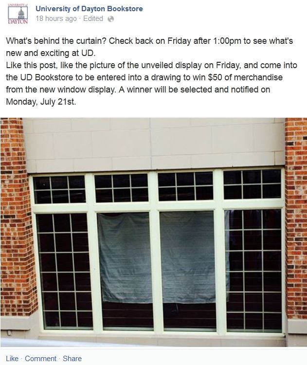
1 pm Friday unveiling? Bookstore just posted something that would suggest it.
Posted via Mobile Device
|
|
4 UDPriders Offer Mad Props to THirt For This Totally Excellent Post:
|
|
07-16-2014, 11:07 AM
|
 |
Lieutenant Colonel
|
|
Join Date: Jul 2001
Location: High Atop Stuart Hill
Posts: 899
Thanks: 1,047
Thanked 822 Times in 337 Posts
|
|
here's the actual facebook post if anyone wishes to like & follow:
|
|
2 UDPriders Offer Mad Props to Columbia Blue For This Totally Excellent Post:
|
|
07-16-2014, 01:24 PM
|
|
Brigadier General
|
|
Join Date: Nov 2007
Location: Section 309
Posts: 2,091
Thanks: 75
Thanked 321 Times in 138 Posts
|
|
|
|
|
4 UDPriders Offer Mad Props to FlyerFanatic21 For This Totally Excellent Post:
|
|
07-16-2014, 01:32 PM
|
 |
Major General
|
|
Join Date: Nov 2007
Location: Miami Twp.
Posts: 3,342
Thanks: 268
Thanked 2,234 Times in 1,038 Posts
|
|
|
Yeah, I'm not a fan. It looks ripped from the mid-80's.
But I figured I would say that about any change, so there you go.
|
07-16-2014, 01:49 PM
|
|
Colonel
|
|
Join Date: Oct 2007
Posts: 1,134
Thanks: 15
Thanked 614 Times in 351 Posts
|
|
|
If Flyerfanatic21 has the correct image for the new logo then the new logo is no big deal.
Posted via Mobile Device
|
07-16-2014, 01:53 PM
|
|
General of the Air Force
|
|
Join Date: Feb 2009
Posts: 7,778
Thanks: 5,498
Thanked 6,255 Times in 3,097 Posts
|
|
|
Better than what I was expecting. I am okay with it. When can I get a hat?
|
|
Mad Props to CE80 For This Totally Excellent Post:
|
|
07-16-2014, 01:53 PM
|
|
|
|
Join Date: Mar 2007
Posts: 13,238
Thanks: 3,991
Thanked 4,603 Times in 2,849 Posts
|
|
|
Is this "it"?
Originally Posted by FlyerFanatic21

|
Originally Posted by priceg75
Yeah, I'm not a fan. It looks ripped from the mid-80's.
But I figured I would say that about any change, so there you go.
|
If this is the new logo I say give it a fair chance...let's see how the new logotype looks on uniforms, sports wear, etc.
It takes time to get used to new things, for them to grow on you, so to speak. Give it a chance Priders.
|
|
2 UDPriders Offer Mad Props to UACFlyer For This Totally Excellent Post:
|
|
07-16-2014, 01:54 PM
|
|
Major
|
|
Join Date: Dec 2001
Posts: 647
Thanks: 53
Thanked 618 Times in 221 Posts
|
|
|
If that is it, I can live with it. It's a clean and simple. The "Dayton" font will look much better on the front of a jersey at least.
Last edited by Gem City; 07-16-2014 at 01:56 PM..
|
07-16-2014, 01:55 PM
|
|
Colonel
|
|
Join Date: Jun 2005
Posts: 1,166
Thanks: 274
Thanked 342 Times in 137 Posts
|
|
|
No big deal other than it sucks and is actually worse than the current one.
|
07-16-2014, 01:55 PM
|
|
2nd Lieutenant
|
|
Join Date: Mar 2014
Posts: 69
Thanks: 56
Thanked 43 Times in 19 Posts
|
|
Originally Posted by FlyerFanatic21
|
This is garbage
|
07-16-2014, 01:56 PM
|
|
Colonel
|
|
Join Date: Oct 2008
Posts: 1,784
Thanks: 140
Thanked 1,145 Times in 598 Posts
|
|
|
I think it's an upgrade. It's going to take a bit to get used to.
|
07-16-2014, 01:57 PM
|
|
|
|
Join Date: May 2001
Posts: 10,410
Thanks: 870
Thanked 6,302 Times in 3,005 Posts
|
|
|
from recent posts on this board my guess some will think it is awesome when draped over a large pair of ...
|
07-16-2014, 01:59 PM
|
 |
|
|
Join Date: Aug 2001
Location: Beverly Hills, MI
Posts: 21,435
Thanks: 339
Thanked 6,944 Times in 2,941 Posts
|
|
|
I like it.
|
|
5 UDPriders Offer Mad Props to Swampy Meadows For This Totally Excellent Post:
|
|
07-16-2014, 02:04 PM
|
 |
2nd Lieutenant
|
|
Join Date: Nov 2005
Location: Circleville, OH
Posts: 98
Thanks: 14
Thanked 42 Times in 16 Posts
|
|
Makes me think of the old cincinnati cyclones logo. which isn't good.

|
07-16-2014, 02:12 PM
|
|
Major
|
|
Join Date: Dec 2001
Posts: 647
Thanks: 53
Thanked 618 Times in 221 Posts
|
|
|
I think the "D" will look good on a football helmet. Anyway, it's going to take sometime to get use to it.
I think you'll have to see it used on a uniform, t-shirt, hat and painted on the basketball floor to really judge it fairly. I'll have to give it some time to sink in.
Either way, the old logo was terrible so this is an improvement.
|
|
Mad Props to Gem City For This Totally Excellent Post:
|
|
07-16-2014, 02:16 PM
|
|
General of the Air Force
|
|
Join Date: Apr 2007
Location: Suburbs of Detroit
Posts: 9,758
Thanks: 218
Thanked 10,115 Times in 2,611 Posts
|
|
|
success on the new logo... I like it
|
|
2 UDPriders Offer Mad Props to lhsgolf19 For This Totally Excellent Post:
|
|
07-16-2014, 02:25 PM
|
|
Captain
|
|
Join Date: Dec 2007
Location: Dayton, OH
Posts: 388
Thanks: 83
Thanked 453 Times in 159 Posts
|
|
|
I actually really like the lettering of "Dayton Flyers" they nailed that aspect of it. Still uncertain on the "D" portion of the logo. I almost think it would look better if you got rid of the tail on the letter and just kept the D, it's too much to look at.
Hopefully the new uniforms are much better. That's what needs the most work.
|
07-16-2014, 02:30 PM
|
|
Just off the Jet
|
|
Join Date: Sep 2013
Posts: 5
Thanks: 0
Thanked 3 Times in 2 Posts
|
|
|
Really
Originally Posted by The Worker
Makes me think of the old cincinnati cyclones logo. which isn't good.
|
You might want to get your eyes checked. That new logo looks nothing like the Cyclones logo.
|
|
2 UDPriders Offer Mad Props to OLELEFTY24 For This Totally Excellent Post:
|
|
07-16-2014, 02:31 PM
|
|
Major
|
|
Join Date: Dec 2001
Posts: 647
Thanks: 53
Thanked 618 Times in 221 Posts
|
|
It's too bad we don't have a varsity hockey team.
Anyway, it's a definite upgrade. UD might not have hit a home run with it, but it's a solid double. I like the fact that it isn't cartoonish like so many other college logo's these days. I mean some of our A-10 partners have logo's that look like they are for a minor league baseball team.
|
07-16-2014, 02:39 PM
|
|
1st Lieutenant
|
|
Join Date: Jul 2014
Posts: 130
Thanks: 5
Thanked 140 Times in 60 Posts
|
|
|
Check out @flyerhoops on twitter. He just tweeted a UD logo. What do you guy think? Looks like the Philly Flyers logo but worse
|
07-16-2014, 02:40 PM
|
 |
Brigadier General
|
|
Join Date: Sep 2005
Location: Columbia, SC
Posts: 2,990
Thanks: 1,012
Thanked 1,772 Times in 935 Posts
|
|
|
About what I expected. Pretty much anything was going to be better than the current logo.
|
07-16-2014, 02:43 PM
|
|
|
|
Join Date: May 2001
Posts: 10,410
Thanks: 870
Thanked 6,302 Times in 3,005 Posts
|
|
Originally Posted by UDFlyer23
I actually really like the lettering of "Dayton Flyers" they nailed that aspect of it. Still uncertain on the "D" portion of the logo.
|
second that
|
07-16-2014, 02:50 PM
|
|
Colonel
|
|
Join Date: Nov 2007
Posts: 1,782
Thanks: 796
Thanked 604 Times in 335 Posts
|
|
|
If that is it, it is an improvement.
|
07-16-2014, 02:53 PM
|
|
Just off the Jet
|
|
Join Date: Sep 2013
Posts: 5
Thanks: 0
Thanked 3 Times in 2 Posts
|
|
Originally Posted by FlyerNation23
Check out @flyerhoops on twitter. He just tweeted a UD logo. What do you guy think? Looks like the Philly Flyers logo but worse
|
It looks to me that Nike had its hands on it. It seems to have a little Oregon like feel. The phillies logo is rounded and not blocked. Whoever says its looks like its from the 80's must just want something to talk about.
|
07-16-2014, 02:58 PM
|
|
Just off the Jet
|
|
Join Date: Sep 2013
Posts: 5
Thanks: 0
Thanked 3 Times in 2 Posts
|
|
Originally Posted by OLELEFTY24
It looks to me that Nike had its hands on it. It seems to have a little Oregon like feel. The phillies logo is rounded and not blocked. Whoever says its looks like its from the 80's must just want something to talk about.
|

|
07-16-2014, 03:05 PM
|
 |
|
|
Join Date: Oct 2000
Posts: 1,741
Thanks: 2,230
Thanked 2,426 Times in 827 Posts
|
|
|
I'm pleasantly surprised. I think it melds elements of classic/contemporary. I wondered initially if they couldn't have found a way to insert the "U" in the blue flashes, but I think it's busy enough as is. The "D" incorporated into "Dayton Flyers" is a huge upgrade, in my opinion. Isn't perfect, but on the whole I think it's a smart move ...
|
07-16-2014, 03:08 PM
|
|
Lieutenant Colonel
|
|
Join Date: Feb 2007
Posts: 985
Thanks: 779
Thanked 700 Times in 275 Posts
|
|
Originally Posted by UDFlyer23
I actually really like the lettering of "Dayton Flyers" they nailed that aspect of it. Still uncertain on the "D" portion of the logo. I almost think it would look better if you got rid of the tail on the letter and just kept the D, it's too much to look at.
Hopefully the new uniforms are much better. That's what needs the most work.
|
I agree. I think the overall design is better, not crazy about the tail on the D, but, let's give it a chance and see how it looks on the products.
|
07-16-2014, 03:10 PM
|
|
Major General
|
|
Join Date: May 2014
Location: NJ Beach Livin'
Posts: 3,237
Thanks: 1,489
Thanked 1,915 Times in 1,085 Posts
|
|
Originally Posted by Sea Bass
second that
|
I third (?) it!
If this is IT then as I was worried about how they pulled off the UD portion is still a concern to me...
As it is, we get irritated when the press/media/whoever says Dayton University. I think this will not help toward solving that. The 'D' being a significant and ONLY letter to trigger in outsiders mind what it is. I do like the 'D' styled and coupled with the wording Dayton Flyers.
I understand the logo as it is at this moment does not yet have a connection to anything (branding = zero). It will be up to many of the sports teams, MBB, WBB, the Soccer teams, VB, track/field, etc. to make the connection of the 'D' to the University.
Residing in sleepyville from a sports perspective will not help that logo connection one little bit ...
my 2 cents worth ....
We shall see ... as it progresses
|
|
|
| Thread Tools |
|
|
| Display Modes |
 Linear Mode Linear Mode
|
 Posting Rules
|
You may not post new threads
You may not post replies
You may not post attachments
You may not edit your posts
HTML code is Off
|
|
|
|


